Web Chat Bots: AI Chat Widget Setup Guide
💡 Want the big picture first? See what an AI web chat widget can do for your website on the Web Chat Widget overview.
Overview
Welcome to the Web Chat Bots guide! This section provides detailed instructions on how to create and customize interactive chat bots for your website using the Mingleego platform. You will learn how to set up a bot from scratch, tailor its appearance to align with your brand, and prepare it for seamless user interaction. This guide is designed to walk you through each step of the process, ensuring you can create a bot that meets your website's needs. Begin with the Creating a New Web Chat Bot section to set up your bot and explore its customization options.
Note: This guide assumes you have already created an account on the Mingleego platform. If not, please sign up here before proceeding.
Creating New Web Chat Bot
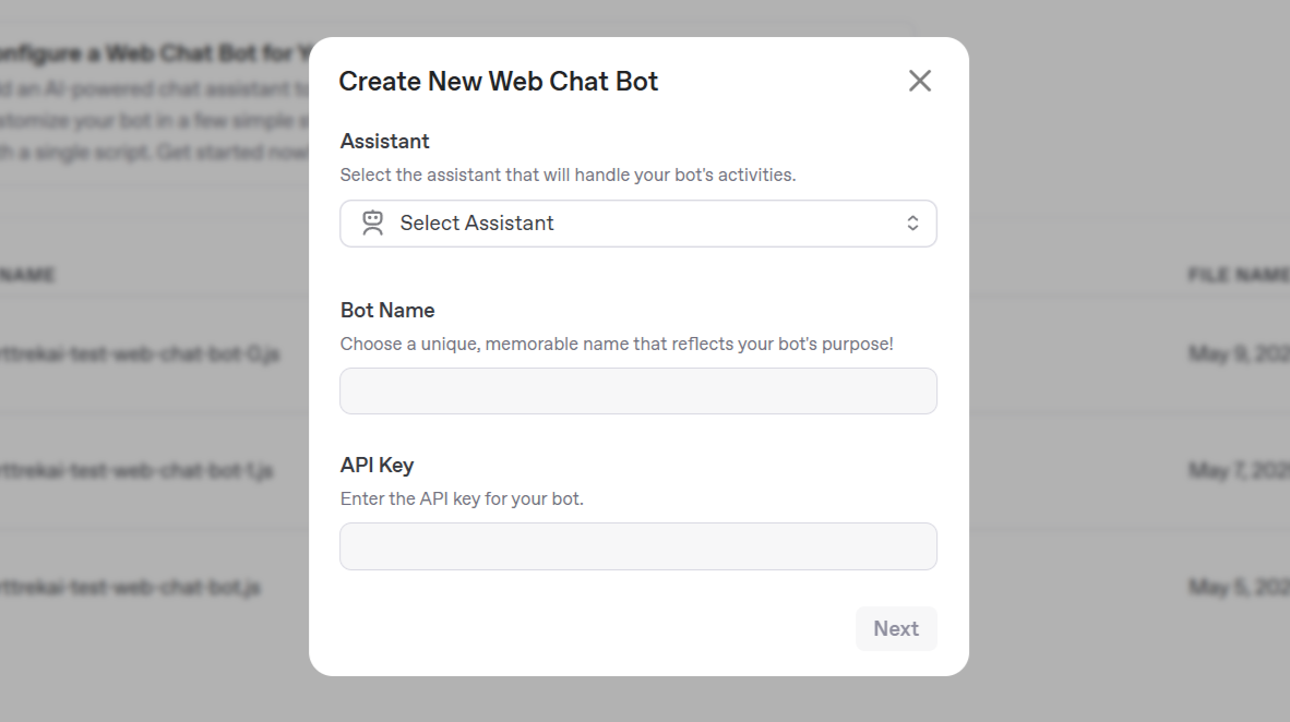
A form will appear, where the details you need to provide to set up your bot include:
-
Assistant: Select an AI assistant that will power your bot's responses. Click the dropdown menu labeled Select Assistant to view the list of available assistants, and choose one that aligns with your bot's purpose, such as answering customer support queries or providing product information.
This assistant will handle all interactions with users.
If no assistants are listed, click the Create Assistant button to set up a new one. For detailed instructions on creating an assistant, refer to the Creating an Assistant Guide.
-
Bot Name: Enter a unique name in the Bot Name field for a support-focused bot.
-
API Key: Input the API key required for your bot to communicate with the Mingleego platform in the API Key field. You can find or generate an API key in the API Keys page. If you create a new API key, ensure you save it securely, as it will not be displayed again after creation.
After filling in these details, click the Next button to save your initial settings and proceed to the Configure the Settings section for customizing your bot's appearance, starting with its icon.
Configure the Settings
Once you have saved your initial settings, you can customize your bot's appearance to match your website's design and user experience goals. The Mingleego platform offers a range of options to adjust the bot's icon, chat window, and interaction settings. The first step is to configure the bot's icon.
Customize the Chatbot Icon
The chatbot icon customization module allows you to adjust the appearance of the icon that users will interact with to initiate a chat. You can customize the icon preview, icon background, and preview area settings. A preview of the icon is displayed on the right side of the module, updating in real-time as you make changes.
The following customization options are available:
Icon Preview
-
Icon Selection: Choose an icon for your chatbot from a list of predefined SVG icons in the left column. Click an icon to select it, and the preview will update to show your choice.
-
Icon Size: Adjust the icon's size using a slider in the left column. The default size is set to a medium value, and you can increase or decrease it as needed. The preview will reflect your changes.
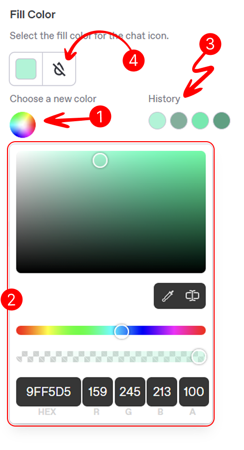
- Fill Color: Set the icon's fill color using a color picker in the right column, as shown in the image to the right:
- Click the color picker area (marked as 1) to open the color selection window.
- Select a shade from the palette (marked as 2) or enter a hex code.
- View the last five selected shades (marked as 3) for quick reuse.
- Reset to the default color using the reset button (marked as 4).
- Stroke Color: Adjust the icon's stroke (outline) color using a similar color picker in the right column. Follow the same steps as for Fill Color: click to open, select a shade or enter a hex code, view recent shades, and reset to default (no outline) if needed.
Icon Background
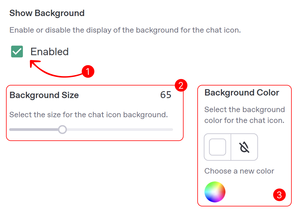
- Show Background: Enable or disable the icon's background using the left-column checkbox. When enabled, a shape (e.g., circle) appears behind it for better visibility; if disabled, it shows without a background.
- Background Size: If enabled, adjust the background size with the left-column slider. The default is slightly larger than the icon for balance; the preview updates accordingly.
- Background Color: If enabled, set the background color using the left-column color picker. Choose a color to match your site, or reset to default with the reset button.
Preview area
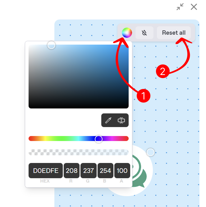
- You can change the background color of the preview area to test how the icon appears against different website backgrounds. As shown in the image to the right, use the color picker in the preview section (indicated by the arrow 1) to select a new background color, or reset it to the default using the reset button next to the color picker.
- Reset all customization settings to their default values by clicking the Reset All button, as shown in the image to the right. This will revert the icon's style, size, colors, and background to their initial settings.
After successfully customizing your bot's icon, click the Next button to proceed to the Chat Appearance section, where you can further adjust the look and behavior of your chat window.
Chat Appearance
The chat appearance customization module allows you to adjust the look and behavior of your bot's chat window. You can configure the chat frame, chat input, messages, and scroll button settings to enhance user interaction.
Chat Frame
The Chat Frame section provides a comprehensive set of options to customize the chat window’s appearance, ensuring it integrates seamlessly with your website’s design.
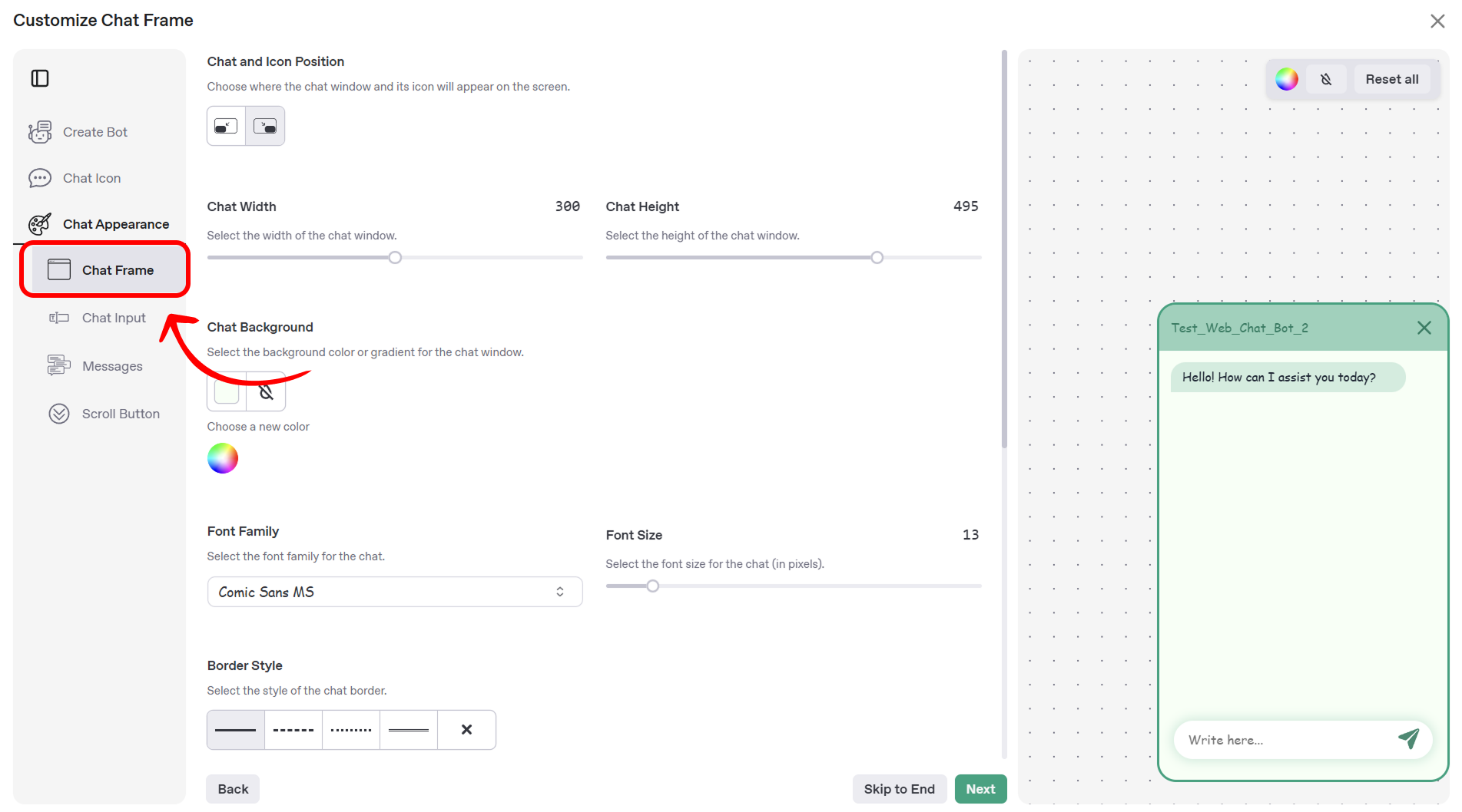
Chat and Icon Position
This setting allows you to determine the placement of both the chat window and its associated icon on your website’s screen.
- Position Selection: Use the position selector to choose between bottom-right or bottom-left placement. The default setting is bottom-right, suitable for most layouts. The preview updates in real-time to reflect your selection.
Chat Width and Height
Fine-tune the dimensions of the chat window to ensure it fits well within your website’s layout. Use the following controls to adjust the width and height:
- Slider: Drag the slider labeled Chat Width or Chat Height to adjust the dimensions. The default width is 390 pixels, and the default height is 495 pixels.
- Input Field: Enter a specific value in the field to the right of the slider for precise adjustments.
- Reset Button: Click the reset button to revert to the default values.
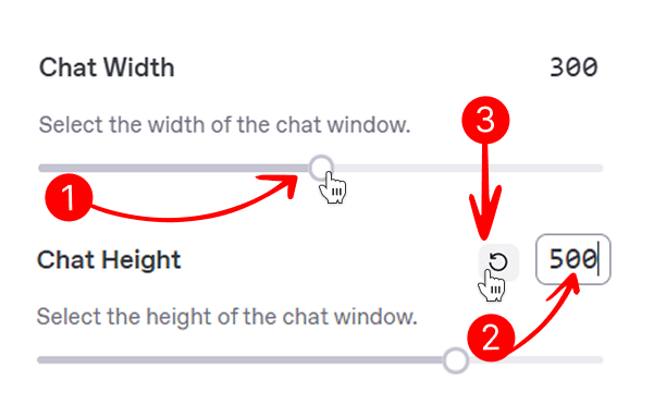
The preview area updates in real-time to reflect your changes.
Chat Background
In addition to the previously described background color settings, the chat background customization includes the following:
- Gradient Option: If desired, enable a gradient background by selecting the gradient option in the color picker (marked as the gradient icon). Choose two colors to create a gradient effect, or reset to a solid color using the reset button.
Font Family and Font Size
Customize the typography of the chat window to align with your website’s branding using the following controls:
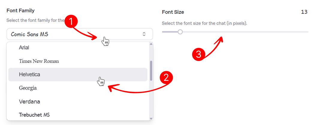
- Font Family Selector: Click the dropdown menu labeled Font Family to open the font selector.
- Font Selection: Choose a font from the list, which may include options such as Comic Sans MS, Arial, or Times New Roman. The default font is Comic Sans MS. The preview updates to reflect your selection.
- Font Size: Adjust the font size of the chat text using the slider labeled Font Size. The size is measured in pixels, with a default value of 13px. Increase or decrease the size to improve readability, and the preview will reflect your changes.
Chat Frame Border
Define the border properties of the chat window to enhance its visual distinction on your website using the following controls:
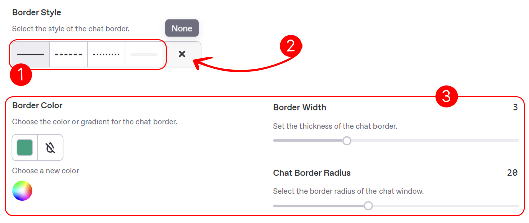
- Border Style: Choose the style of the chat window’s border using the dropdown menu labeled Border Style. Options include solid, dashed, dotted, double, or none. The default style is solid. Once a style is selected, additional settings (marked as 3) for border color, width, and radius will appear below. The preview updates to reflect your selection.
- Reset Border: Select the none option in the Border Style dropdown to remove the border and hide the additional settings (border color, width, and radius). This resets the border to its default state (no border).
- Additional Settings: When a border style other than none is selected, the following options become available:
- Border Color: Click the color picker area to open the color selection window. Select a shade from the palette or enter a hex code. Reset to the default color (transparent) using the reset button.
- Border Width: Adjust the thickness of the border using the slider labeled Border Width. The default width is 3 pixels. The preview updates in real-time.
- Chat Border Radius: Set the border radius using the slider labeled Chat Border Radius. The default radius is 20 pixels, providing a slightly rounded appearance. The preview reflects your changes.
Chat Header
Customize the header of the chat window to display relevant information and align with your branding using the following controls:
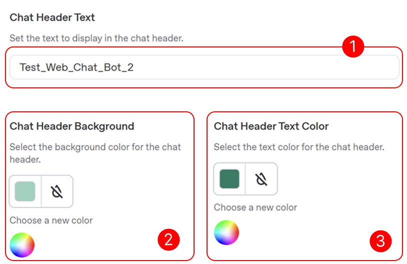
- Chat Header Text: Enter the text to display in the chat header using the input field labeled Chat Header Text. By default, this field displays the bot’s name (e.g., “Test_Web_Chat_Bot_2”). You can update it to a meaningful title, such as a welcome message, to help users identify the chat’s purpose. Alternatively, clear the field to display no header text.
- Chat Header Background: Click the color picker area in the Chat Header Background section to open the color selection window. Select a shade from the palette or enter a hex code. Reset to the default color using the reset button.
- Chat Header Text Color: Click the color picker area in the Chat Header Text Color section to open the color selection window. Select a shade from the palette or enter a hex code. Reset to the default color using the reset button.
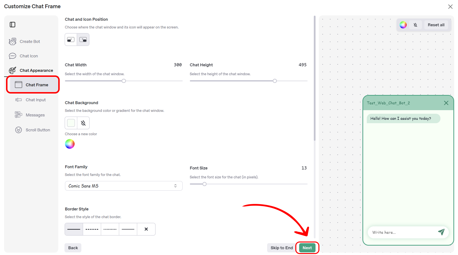
After completing the customization of the chat frame, you have successfully defined the overall appearance of your chat window, including its position, size, typography, border, and header. Click the Next button to proceed to the Chat Input section, where you can configure the appearance and behavior of the input field for user messages.
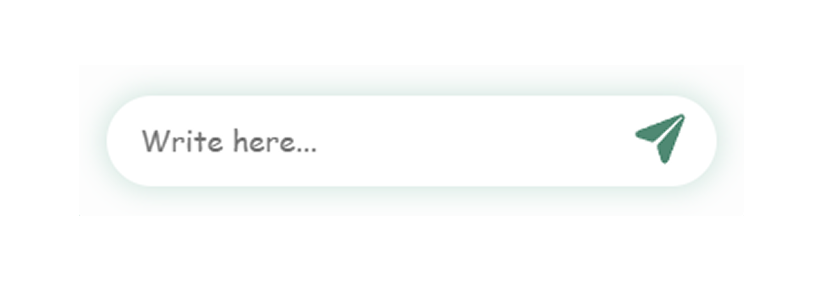
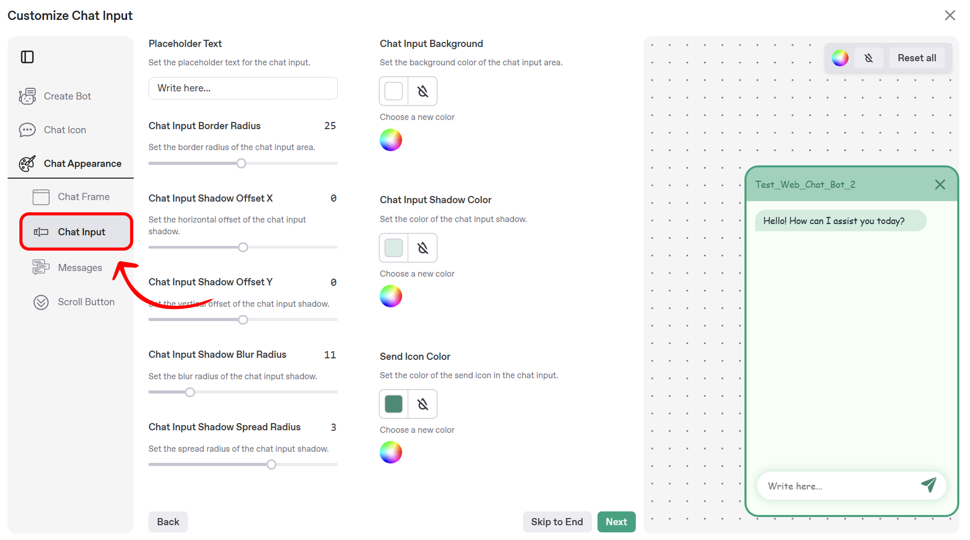
Chat Input
This section allows you to customize the appearance and behavior of the chat input field—the area where users type their messages in the chat window. Below is an example of the chat input field as it appears in the chat:
The Mingleego platform provides a range of options to tailor this field to align with your website’s design and user experience goals. You can adjust settings such as the placeholder text, border radius, background color, shadow effects, and send icon color.
Overview of Customization Options
The following fields are available for customization in this section:
- Placeholder Text: Define the default text that appears in the input field to prompt user interaction.
- Chat Input Border Radius: Adjust the rounded corners of the input field for a customized shape.
- Chat Input Background: Set the background color of the input field to match your website’s theme.
- Chat Input Shadow (Offset X, Offset Y, Blur Radius, Spread Radius, Color): Apply and fine-tune shadow effects to add depth to the input field.
- Send Icon Color: Customize the color of the send icon to complement the input field’s design.
Detailed Customization Options
The following customization options are available:
- Placeholder Text: Set the placeholder text that appears in the chat input field by entering your desired text in the field labeled Placeholder Text. The default text is “Write here…”. Update this to a prompt that encourages user interaction, such as “Type your message…” or “Ask a question…”.
- Chat Input Border Radius: Adjust the border radius of the chat input field using the slider labeled Chat Input Border Radius. The default value is 25 pixels, providing a rounded appearance. Modify this value to create sharper or more rounded corners, with changes reflected in the preview.
- Chat Input Background:
- Click the color picker area in the Chat Input Background section to open the color selection window.
- Select a shade from the palette or enter a hex code.
- Reset to the default color (white) using the reset button.
- Chat Input Shadow Offset X: Set the horizontal offset of the chat input field’s shadow using the slider labeled Chat Input Shadow Offset X. The default value is 0 pixels. Adjust this to shift the shadow left or right, with the preview updating in real-time.
- Chat Input Shadow Offset Y: Set the vertical offset of the chat input field’s shadow using the slider labeled Chat Input Shadow Offset Y. The default value is 0 pixels. Adjust this to shift the shadow up or down, as reflected in the preview.
- Chat Input Shadow Blur Radius: Define the blur radius of the chat input field’s shadow using the slider labeled Chat Input Shadow Blur Radius. The default value is 11 pixels. Increase or decrease this value to make the shadow more or less diffused, with the preview showing the effect.
- Chat Input Shadow Spread Radius: Set the spread radius of the chat input field’s shadow using the slider labeled Chat Input Shadow Spread Radius. The default value is 3 pixels. Adjust this to expand or contract the shadow’s coverage, with changes visible in the preview.
- Chat Input Shadow Color:
- Click the color picker area in the Chat Input Shadow Color section to open the color selection window.
- Select a shade from the palette or enter a hex code.
- Reset to the default color (transparent) using the reset button.
- Send Icon Color:
- Click the color picker area in the Send Icon Color section to open the color selection window.
- Select a shade from the palette or enter a hex code.
- Reset to the default color using the reset button.
After configuring these settings, click the Next button to proceed to the Messages section, where you can customize the appearance of the chat messages.
Messages
This section enables you to customize the appearance and behavior of chat messages within the chat window. You can configure the background colors for user and bot messages, adjust the border radius, enable or disable streaming responses, and set a default message to display when the chat opens.
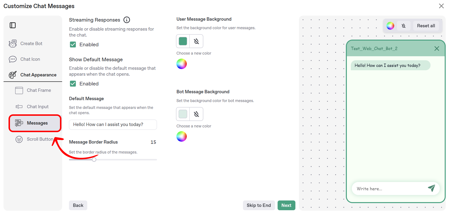
The following customization options are available:
-
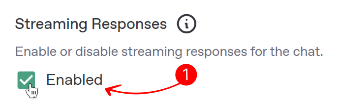
Streaming Responses: Enable or disable the streaming effect for the chatbot’s responses using the checkbox labeled Streaming Responses. When enabled (default), the chatbot’s answers appear gradually, simulating the effect of typing in a real conversation, which can make interactions feel more natural and engaging. When disabled, the full answer is displayed instantly, which may be preferred for faster communication. Toggle this option based on your desired user experience, and the preview will reflect the behavior.
-
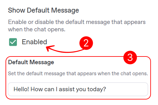
Show Default Message: Enable or disable the display of a default message when the chat opens using the checkbox labeled Show Default Message. When enabled (default), a predefined message is shown to greet users as soon as the chat window opens. If disabled, the chat window will open without an initial message.
-
Default Message: Set the default message that appears when the chat opens by entering your desired text in the field labeled Default Message. The default text is “Hello! How can I assist you today?”. Update this to a greeting that suits your bot’s purpose, such as “Welcome! How can I help you?” or “Hi there! Ask me anything.” This option is only active if Show Default Message is enabled.
-
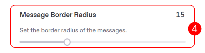
Message Border Radius: Adjust the border radius of all chat messages using the slider labeled Message Border Radius. The default value is 15 pixels, providing a slightly rounded appearance. Modify this value to create sharper or more rounded corners, with changes reflected in the preview.
-
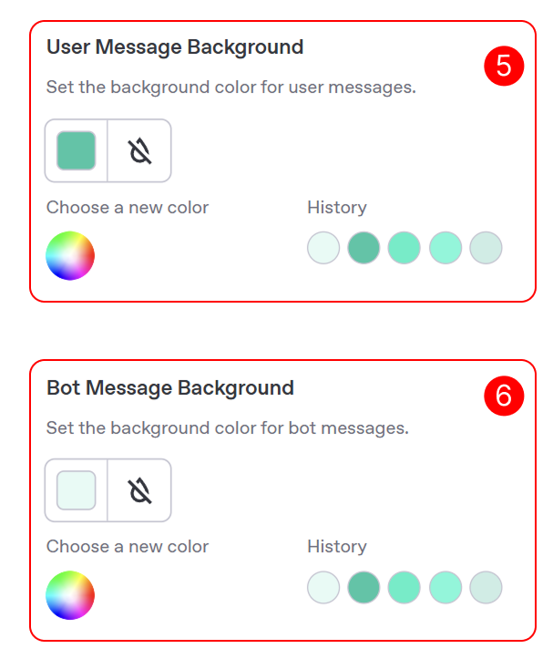
User Message Background: Customize the background color of messages sent by the user in the chat. In the User Message Background section, use the color picker to define how user messages will appear in the chat window. To select a color, click the small colored square to the right of the label to open the color selection window, choose a shade from the palette or enter a hex code, and reset to the default color using the small circular arrow next to the color picker.
-
Bot Message Background: Customize the background color of messages sent by the bot in the chat. In the Bot Message Background section, use the color picker to define how bot messages will appear in the chat window. Follow the same steps as above to select a color and reset to the default if needed.
After configuring these settings, click the Next button to proceed to the Scroll Button section, where you can customize the appearance of the scroll button for navigating the chat.
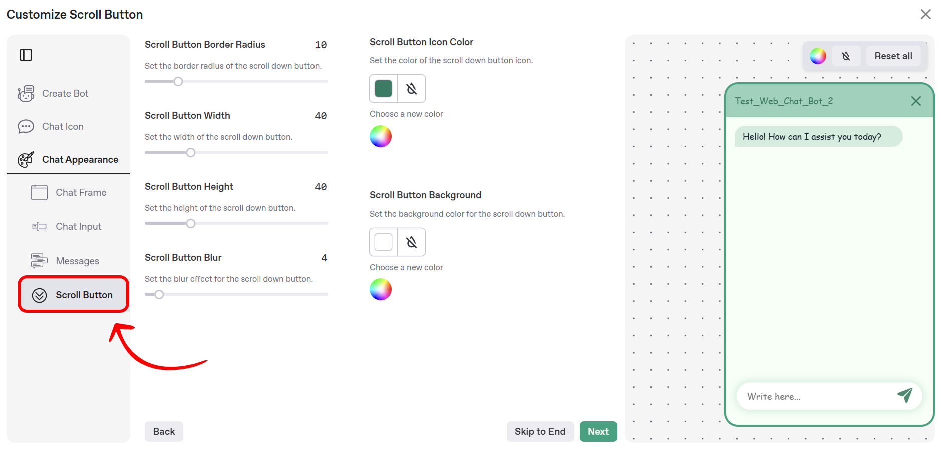
Scroll Button
This section allows you to customize the appearance of the scroll button, which enables users to navigate to the latest messages in the chat window. The Mingleego platform provides options to adjust the button’s border radius, dimensions, blur effect, icon color, and background color, ensuring it complements your chat window’s design.
The following customization options are available:
- Scroll Button Border Radius: Adjust the border radius of the scroll button using the slider labeled Scroll Button Border Radius. The default value is 10 pixels, providing a slightly rounded appearance. Modify this value to create sharper or more rounded corners, with changes reflected in the preview.
- Scroll Button Width: Set the width of the scroll button using the slider labeled Scroll Button Width. The default value is 40 pixels. Adjust this to make the button wider or narrower, with the preview updating in real-time.
- Scroll Button Height: Set the height of the scroll button using the slider labeled Scroll Button Height. The default value is 40 pixels. Adjust this to make the button taller or shorter, as reflected in the preview.
- Scroll Button Blur: Define the blur effect for the scroll button using the slider labeled Scroll Button Blur. The default value is 4 pixels. Increase or decrease this value to make the button’s shadow more or less diffused, with the preview showing the effect.
- Scroll Button Icon Color:
- Click the color picker area in the Scroll Button Icon Color section to open the color selection window.
- Select a shade from the palette or enter a hex code.
- Reset to the default color using the reset button.
- Scroll Button Background:
- Click the color picker area in the Scroll Button Background section to open the color selection window.
- Select a shade from the palette or enter a hex code.
- Reset to the default color (white) using the reset button.
After configuring these settings, click the Create button to apply your changes. This finalizes the entire bot creation process, including the initial setup, icon customization, and chat appearance configuration. You can now proceed to the Integration section to learn how to add your bot to your website.
User ID for Chat History Identification
Overview
When a user interacts with your Mingleego web chat bot on your website, the chat generates a unique identifier, called smartTrekUserId, to track their conversation history. This identifier is stored in the browser's localStorage and is used to associate chat messages with a specific user session. Understanding how smartTrekUserId works is essential if you want to link chat histories to specific users on your website, especially for scenarios involving user authentication (e.g., when a user logs in).
This section explains how smartTrekUserId is generated, stored, and managed, and provides guidance on how you can retrieve and use it to enhance user experience. You’ll learn:
- How the chat bot generates and stores
smartTrekUserId. - How to retrieve
smartTrekUserIdfromlocalStorage. - The lifespan of
smartTrekUserIdand how it can be removed. - How to link
smartTrekUserIdto your authenticated users for persistent chat history.
Note: The smartTrekUserId is specific to the browser and device used by the end user. If a user clears their browser data or uses a different device, a new smartTrekUserId will be generated.
How User ID Works
The Mingleego chat bot automatically manages the smartTrekUserId for each user interacting with the chat on your website. Here’s how it works:
-
Generation:
- When a user opens the chat for the first time, the chat checks
localStoragefor an existingsmartTrekUserId. - If no
smartTrekUserIdis found, the chat generates a new unique identifier using the UUID v4 format, prefixed withuser-(e.g.,user-123e4567-e89b-12d3-a456-426614174000). - The generated
smartTrekUserIdis stored inlocalStorageunder the keysmartTrekUserId.
- When a user opens the chat for the first time, the chat checks
-
Usage:
- The
smartTrekUserIdis included in every message sent to the Mingleego backend, allowing the platform to associate the conversation with the specific user session. - This ensures that the chat history is preserved for the user as long as the
smartTrekUserIdremains inlocalStorage.
- The
-
Lifespan:
- The
smartTrekUserIdpersists inlocalStorageuntil it is explicitly removed (e.g., by clearing browser data or programmatically deleting the key). - It does not expire automatically, making it suitable for maintaining long-term chat histories.
- The
-
Removal:
- The
smartTrekUserIdcan be removed by:- The user clearing their browser’s
localStorageor all browsing data. - Your website’s code programmatically removing the key (e.g.,
localStorage.removeItem("smartTrekUserId")). - The chat bot does not automatically delete
smartTrekUserIdunless instructed.
- The user clearing their browser’s
- The
Retrieving User ID from localStorage
As the website owner, you can access the smartTrekUserId stored in localStorage to link it with your user data (e.g., after a user logs in). Below is an example of how to retrieve the smartTrekUserId using JavaScript:
1 2 3 4 5 6 7 8 9 10 11 12 13 14 15 16
This code checks for the smartTrekUserId in localStorage and logs it to the console. If the user has not yet interacted with the chat, the key may not exist until the chat is opened.
Linking User ID to Authenticated Users
To maintain a consistent chat history for authenticated users (e.g., after they log in), you can associate the smartTrekUserId with their account in your backend. This is particularly useful if you want to retrieve a user’s chat history across sessions or devices. Here’s how you can implement this:
-
Retrieve
smartTrekUserIdAfter Login:- When a user logs in to your website, retrieve the
smartTrekUserIdfromlocalStorage. - Send the
smartTrekUserIdto your backend along with the user’s account ID.
1 2 3 4 5 6 7 8 9 10 11 12 13 14 15 16 17 18 19 20 21 22 23 - When a user logs in to your website, retrieve the
-
Preserve
smartTrekUserIdAcross Sessions:- After linking the
smartTrekUserIdto the user’s account, store it in your backend database. - When the user logs in on a new device or browser, retrieve the
smartTrekUserIdfrom your backend and set it inlocalStoragebefore the chat initializes.
1 2 3 4 5 6 7 8 9 10 11 12 13 14 15 16 17 18 19 20 - After linking the
-
Handle Chat History:
- Use the
smartTrekUserIdto query the Mingleego API for the user’s chat history, if needed. Contact the Mingleego support team for API details on retrieving chat history.
- Use the
Below is a complete example of how to handle smartTrekUserId in a React application after a user logs in:
1 2 3 4 5 6 7 8 9 10 11 12 13 14 15 16 17 18 19 20 21 22 23 24 25 26 27 28 29 30 31 32 33 34 35 36 37 38 39 40 41 42 43 44 45 46 47 48 49 50 51 52 53 54 55
This component runs after a user logs in, checks for an existing smartTrekUserId, links it to the user’s account, and fetches a previously stored smartTrekUserId from your backend if needed. -->
Best Practices
- Secure Storage: Do not expose
smartTrekUserIdin client-side code unnecessarily. Only retrieve and send it to your backend when linking to an account. - User Privacy: Inform users that their chat interactions are associated with a unique identifier for history tracking, and provide an option to clear chat history (e.g., by removing
smartTrekUserId). - Handle Edge Cases:
- If a user logs in on a new device, ensure your backend can sync their
smartTrekUserId. - If
localStorageis disabled in the user’s browser, consider fallback mechanisms (e.g., prompting the user to enable it).
- If a user logs in on a new device, ensure your backend can sync their
- Testing: Test the integration by simulating user logins and verifying that the chat history persists correctly.
Removing User ID
To clear a user’s chat history or disassociate their smartTrekUserId, you can remove it from localStorage. Here’s an example:
1 2 3 4 5 6 7 8 9 10 11 12 13
Note: Removing smartTrekUserId will cause a new ID to be generated the next time the user interacts with the chat, starting a new chat history.